
Mood
Sculpture - 2022
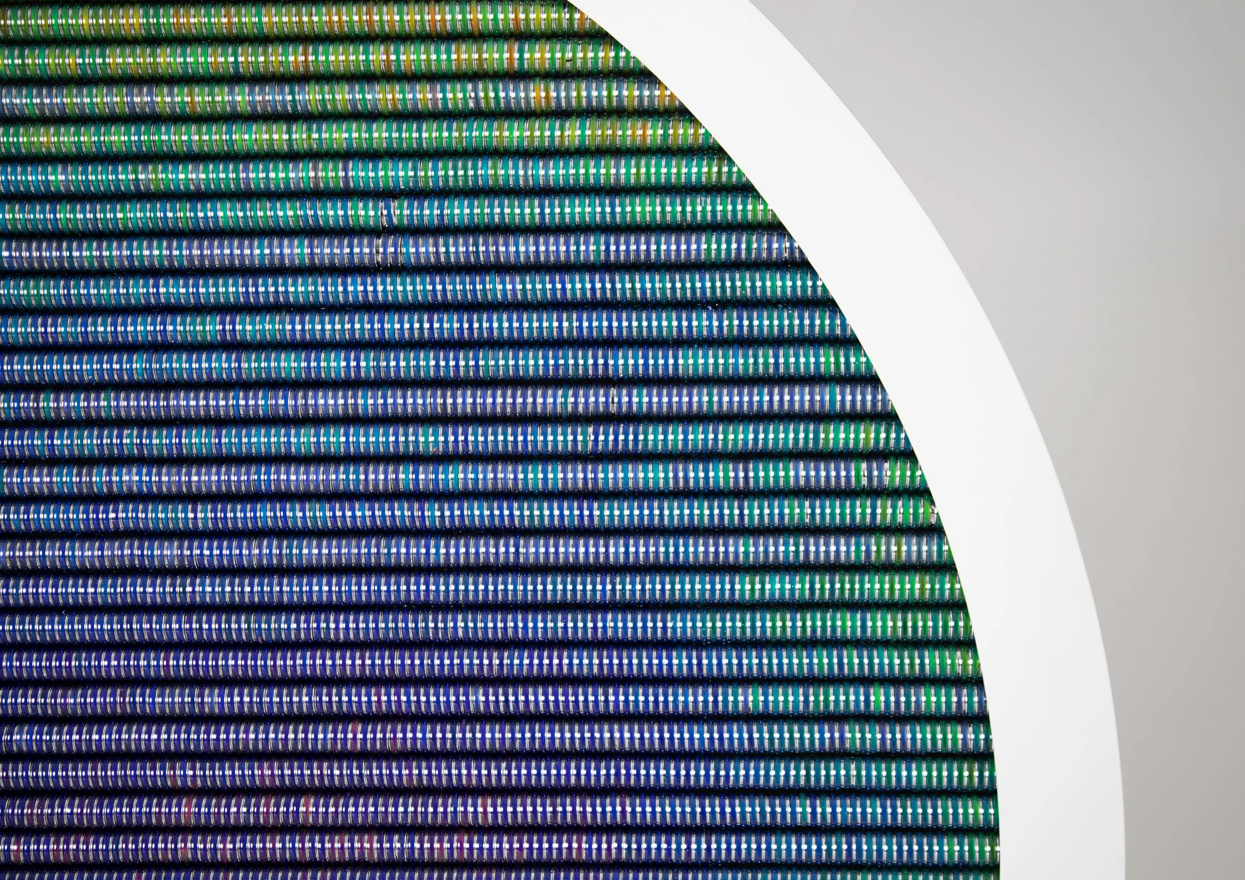
Our mood can quickly change throughout the day, responding to everything from hormones to daylight. But what if the mood of an artwork could change as quickly? ‘Mood Screens’ is an interactive sculpture made from 10,000 mood rings. The piece changes throughout the day, moving from a smile to a frown over time, representing the fleeting nature of our mood.
1.8x1.8m. Powder coated steel frame with 10,000 mood rings controlled by programmable heat pads. Made in collaboration with Ben Polkinghorne.
Are we well yet
Sculpture - 2022

An icon for the early 21st century - 'Are we well yet' (2022) represent two competing, yet interlinked, ideas. The fast, utopian promise of technology. And the growing wellness industry which promises to fix the modern ailments of anxiety and depression.
On display at Holy Art Gallery, London, June 2022
Luxury
Design / textile - 2021
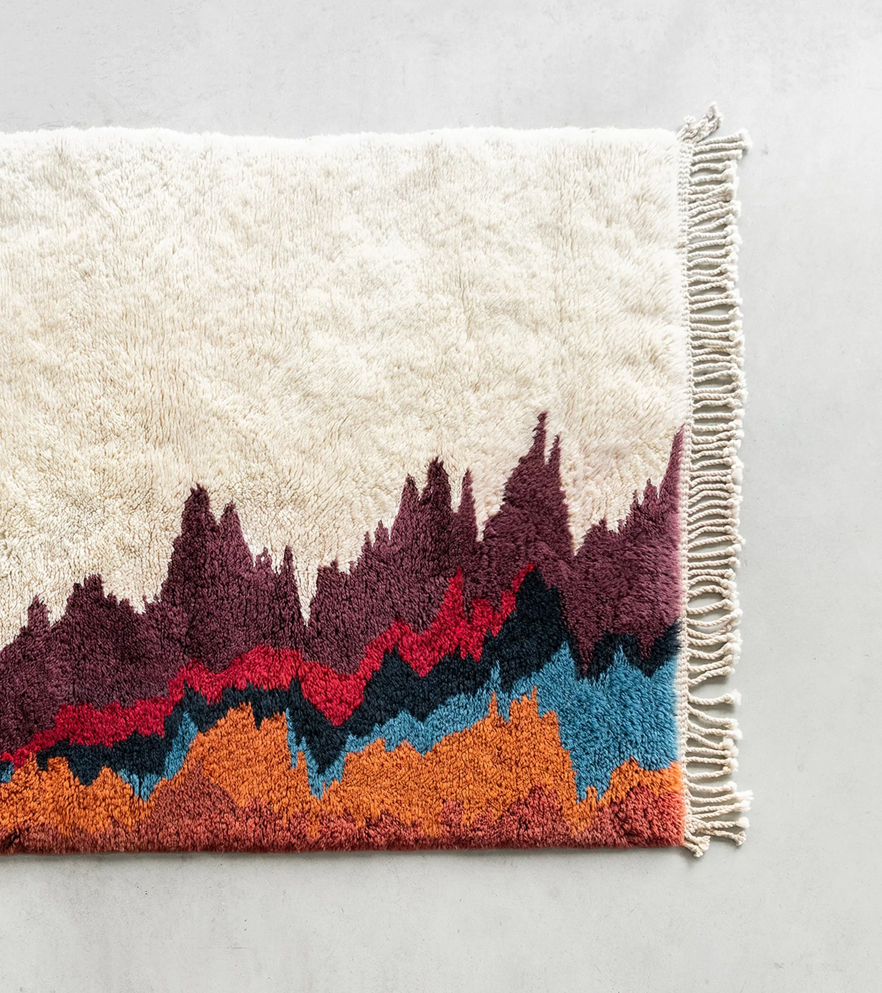
‘Luxury’ (2021) is a thick piled handmade rug which takes its unique pattern from the stock results of major luxury fashion houses. Over the last 5 years these 6 corporations have seen relentless growth, hardly registering the Covid 19 pandemic.
The series avoids the tropes and ostentatiousness of luxury and instead embraces it’s economic convulsions - these economic patterns are often ignored by the general public, but are a man made pattern in their own right.
The piece is one of 5 and seeks to challenge our notion of luxury, craft and the handmade.
Photography: Perry Graham
Baldpieces
Design - 2021
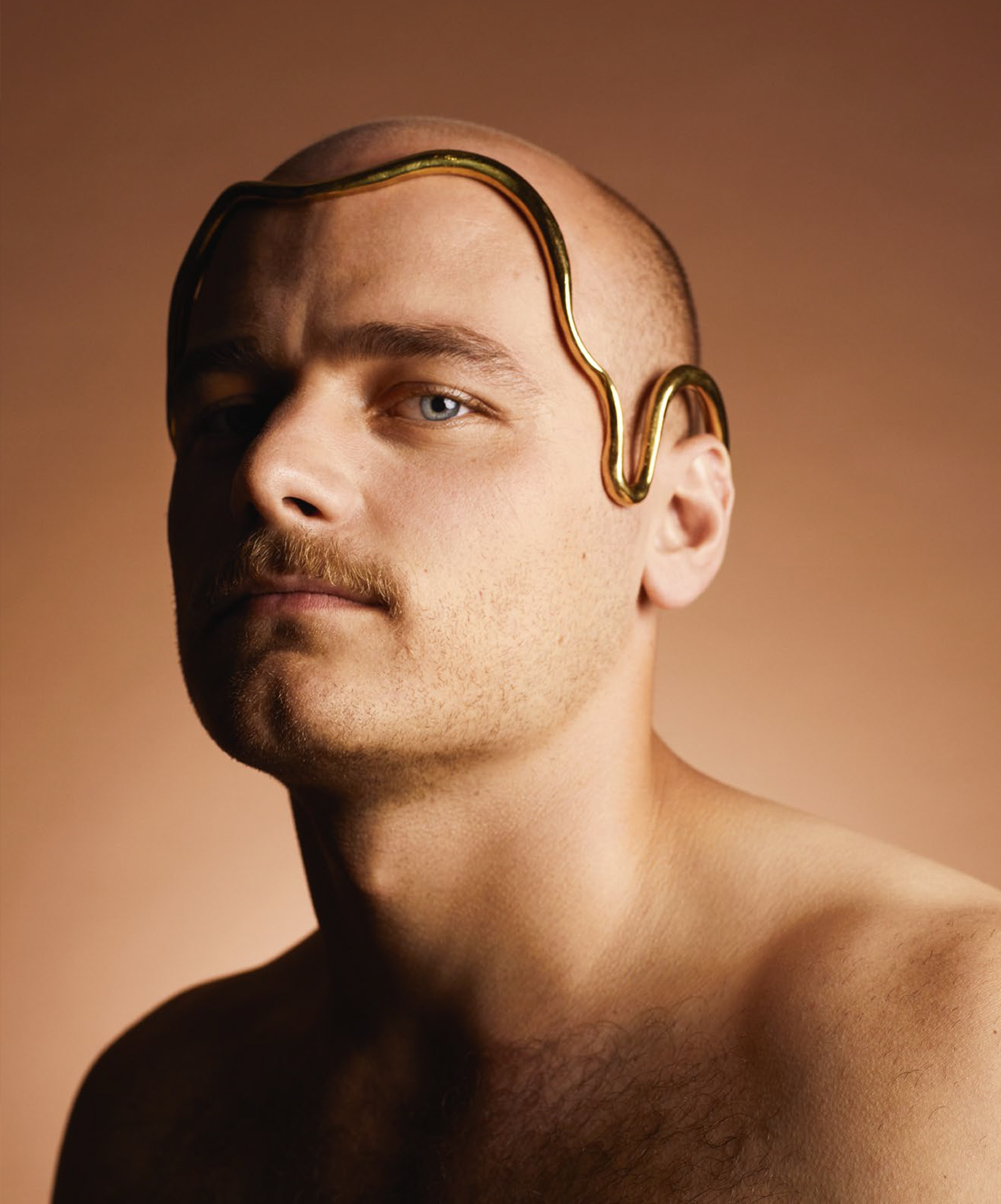
Crowns to adorn balding crowns.
Baldpieces (2021) is an 8 piece collection of crowns, designed to tackle themes of masculinity and mortality. The crowns and the accompanying photo series (captured by esteemed photographer Rankin) imagines an alternate reality for men. A world in which instead of covering up the skin left by male pattern baldness, they proudly highlight the unique shapes. Balding naturally comes with aging, predominantly with men, and the designs embrace forms and materials which evoke the wisdom and influence that often comes with that aging process.
The crowns were a collaboration between myself, Ben Polkinghorne and 8 designers and artists from around the globe: Gregory Kara, Carina Shoshtary, Marina Getman, Marija Puipaite, Stephanie Bila, Laura Estrada, Paula Mendoza and Nika Danielska.
The series had an 8 page editorial in the September issue of Hunger Magazine, in printed and online edition of The Guardian newspaper and myself and Ben were interviewed live on The Times Radio.
Signs of the Times
Sculpture - 2017 - 2019
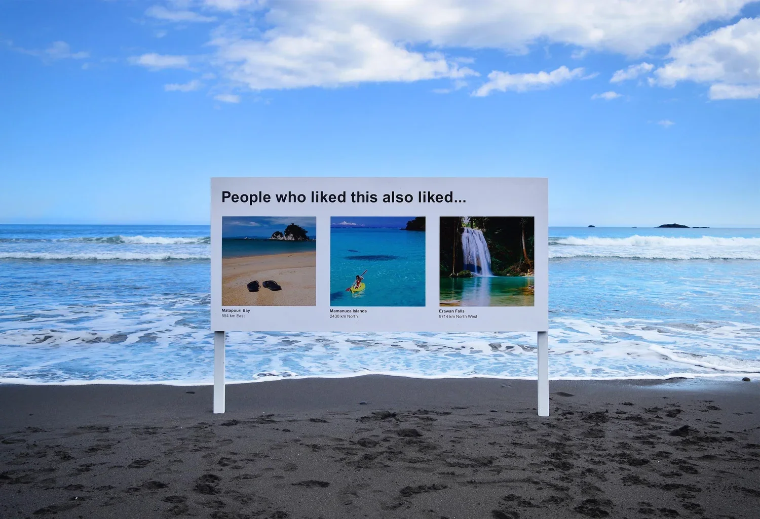
Signs of the Times (2017) is a sculpture series which appeared in various locations around New Zealand. As the online world makes its way more and more into our offline world, the series aims to question how our decisions online are influenced by algorithms. The droll series challenges the audience to question these invisible algorithms and allows us to envisage a not so distant future where these decision influencing algorithms are inescapable.
The project was a viral news story, with interviews in the BBC, from Arianna Huffington, Verge, FastCompany, Lonely Planet, Smithsonian, Design Boom, GQ amongst others. The work has continued to be shared online, at last count garnering upwards of a million likes.
A follow up series was created in South Korea in 2018 after an invitation by the Seoul Museum of Art for their Seoul Mediacity Biennale. In addition, in 2019, a five piece series was commissioned by Cornwall Park - New Zealand’s largest park.
This project is a collaboration between myself and Ben Polkinghorne.
Searching for meaning
Single edition prints, public display - 2021

When the world wants to see something - anything - they turn to Google Images. How does Google cope with the avalanche of searches? With an efficient technique called ‘lazy loading’. This process limits the drain on data by reducing each image to its single dominant colour. Scroll quickly to see it in action. This automated mass media process is interesting in its own right, but when you search broad, abstract ideas such as ‘God’ or ‘The Future’ you can see a subject like you never knew you could.
This process of interception, reveal the visual essence of any subject - subjects that don’t obviously have a colour - like ‘the Queen’. Some of the results are beautiful apt - like the colourful disco dance floor of ecstasy. And some are perplexing, why is ‘The Future’ blue?
This work was brought to life with single edition prints and a public display of the work in Shoreditch, London. Special thanks to Lorna Tiller and Outside the Zone Gallery.
For further reading on the series, please read Chiara Wilkenson’s essay on the series.
Danger
Hand pulled three colour gradient, black spot varnish and gold foil. Edition of 10 - 2021
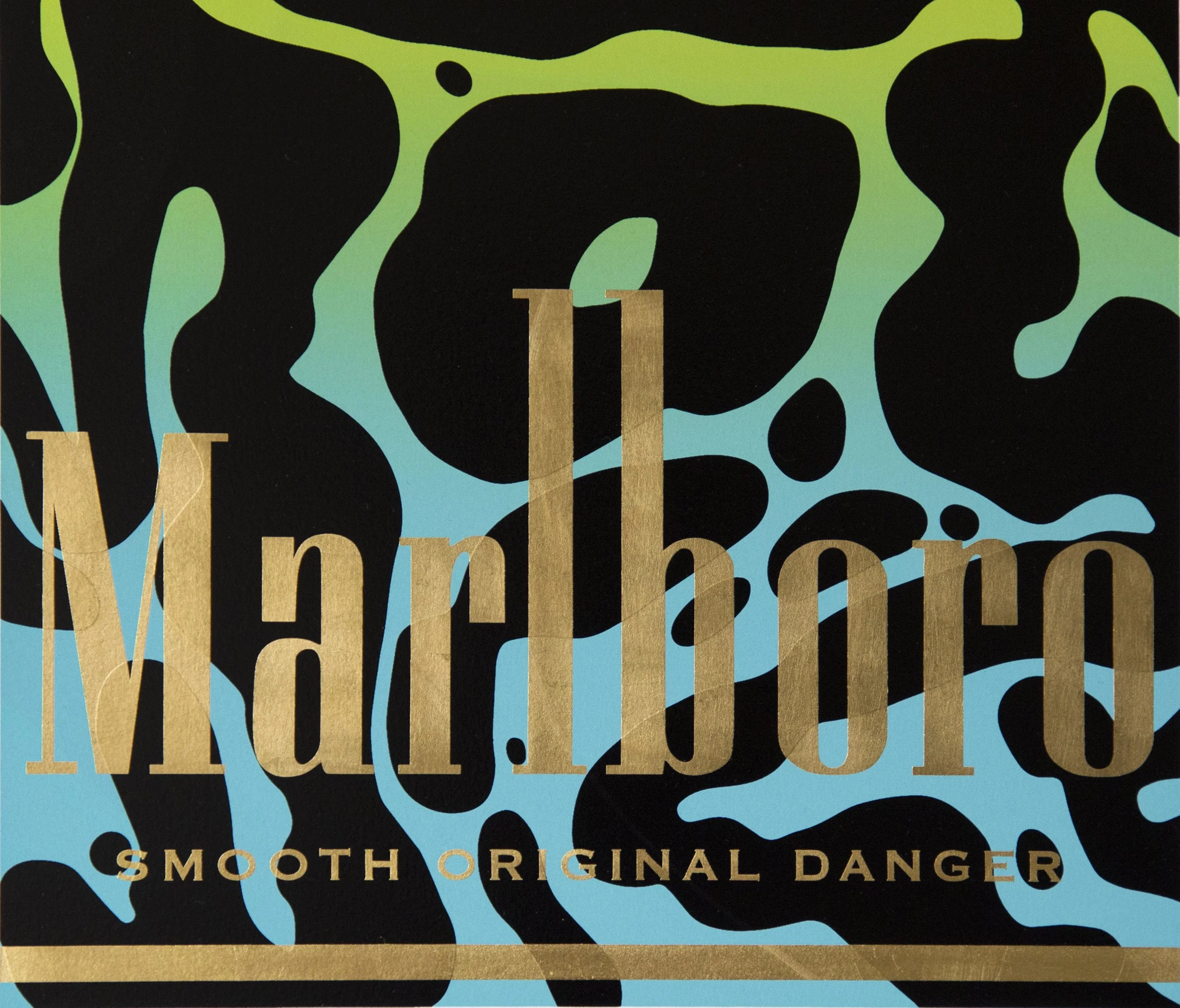
Aposematic design appears on the skin of species like poison frogs, snakes and some mammals and evolved as a form of advertising to warn predators against eating them. This animal kingdom warning system, typically taking the form of bright colours and bold patterns, suggests high levels of toxicity in the skin.
‘Danger’ is a 3 layer hand pulled screen print series which uses aposematic design on classic cigarette packaging. Imagining a world in which bad for your health consumer products also expressed their toxicity with bold colours and striking patterns. The hand pulled gradient, oily black varnish and gold foil combine to create a disorienting yet satisfying finish. This print was made in an edition of 10 and is sold out.